Showing posts with label Tim Holtz. Show all posts

Thursday, July 5, 2012

Theme Thursday Snow Day

It is Theme Day Thursday at My Cricut Craft Room and the theme I am working with is Snow Day. We don't get much snow down here in Louisiana and or growing up in San Antonio, so I decided to go with a card. Most of you know I don't make cards like a normal person. I start out with an emotion or feeling and try to express it through my card front. I started looking through my Cricut cartridges and I really liked this building a snow woman silhouette. I started thinking about snow days and thinking about childhood and making mistakes. Especially when you aren't used to the snow.So here is what I came up with for your viewing pleasure.

I cut the silhouette at 3 1/4 inches from smooth black card stock. The card front is a a piece of pearlized white card stock. The background was created using my favorite products Tim Holtz Distress Inks. I started with the Stormy Sky distress ink pad. I wanted light coverage, so the pearl would still shine through, so I used a felt pad instead of a foam pad. Once I had the blue background it was a little too blue, so I added just a bit of Weathered Wood distress ink to give it that touch of steely grey in a winter sky. The swirls were stamped off the edge using the large swirl stamp in the Tim Holtz large stamps set Urban Chic. I know for me personally 29.99 sounds outrageous for a set of stamps, but that is the retail. I had to wait for a sale, but they are so worth it. I use this set all the time. If you can't afford them now, make a point to get them the next time Erica has a sale. There isn't a picture on Erica's site, but here is a pic of the stamps on this set.

I used the Stormy Sky ink to stamps the swirls and then outlined then in Waterfall Stickles. I was trying to create the feeling of the swirling snow. In between I added some stickles snowflakes in stardust stickles and they were also used to make the snow at the bottom of the page.

The skirt and scarf were colored in with liquid pearls. I was thinking of a child not used to snow bringing out their mother's silk or satin and ruining it. That is the type of thing I would have done. The skirt, mouth, and dots on the scarf are Liquid Pearls Flamingo. The scarf is Liquid Pearls Ocean Blue.


 Lots of fun great products here. Now if that wasn't enough, I have one more trick up my sleeve. I have a sneak peek for you. One of our new design team members was eager to get started and created a card for today. Since the big reveal of the new design team members isn't until Sunday, she can't post her card today. I thought you might enjoy a peek though of what lies in store.

Now head on over to My Cricut Craft Room and see what my design team sisters have in store for you.

Sunday, June 24, 2012

Just How Far Can One Set Go?

Have you see the Card Decor Sets at Globecraft Memories? These sets are fabulous. I have been playing with Card Decor Set #1  and am amazed. I am a frugal woman and love the bang for your buck you get with these sets. They are inexpensive; they are only $3.99 and when you can get four or five projects out of one set they are a bargain.


These are the pieces that come in set #1.  Of course they are bare book quality chipboard like all of the Piccolo pieces. I will let you know that the fine details in the vines make removing them a little harder than some of the pieces. I found a straight pin worked great for pushing them out.

I was wanting to make a card, but I hate to think of my work ending up in a drawer or worse yet in the trash. If you are like me, you are going to love this new item coming out soon. It is an easel card. You simply decorate the front like you would any other card front, but it has a built in easel to insure it ends up displayed by the recipient. I am telling you I love this.

 Of course when I see blank white cardstock I start to see visions of distress ink, so I inked up the front with Weathered Wood and Dusty Concord Distress inks. I made sure to ink the base flap too as it will show a bit when on display.
 Once I had the back ground inked, I stamped the sentiment. I love how whimsical this came out.
 The vines needed to be green. I started to pick up paint, but then I thought about the Mossy Glen Enamel Powder. I love the way it came out. It is such a gorgeous green. These enamel powders are so easy to use. I covered them with Enamel Adhesive which is a snap with the dauber top. I then sprinkled the mossy glen over it. I did a full heat set. I melted it until it was completely smooth. I glued it down using Matte Glastique. This is more than just an adhesive, but on projects like this I love that if I am messy in my gluing it doesn't show. It dries completely clear. You honestly can't see it.
 The butterflies were punched out of white cardstock. They were coated in enamel adhesive and then sprinkled with Enchanted Aubergine. I did a full heat making the enamel completely smooth again. The colors are just beautiful. I used the Glastique to adhere the butterflies too.
 The butterfly trails were ditted ion using Stickles. It was a fun little touch.
When I finished it still needed just a little something more, so I took my Versamark marker and ran it around the very edge of the card front. I then sprinkled Vintage Silver Embossing Enamel around the edge and then heat set it. It just finished it off perfectly.

This picture shows it lying flat to slide in an envelope and mail. This was project #1 from set #1. I apologize in advance for the reflections in the photos of project #2. We were experiencing what I call liquid sunshine. It was sunny out, but raining. It was just enough rain to keep me from being able to take photos outside. The lighting in my home is awful and reflected in the photograph on the layout.
 Just a quick scrapbook page I was making using Echo Park papers. It was pretty, but fell just a bit flat. The addition  of some pieces out of this set aids the eye in moving through the list of adjectives. The vines at the top us Mossy Glen, but the flourishes were cover in 24K Gold. The little heart anchors it all and is covered in Cranberry Wine Enamel Powder.
Here is a better picture showing how it moves your eye through the list. Okay, two projects down and I think three more to go in order to use this whole set. Make sure you head over  to Facebook and like our page there. I will make sure I link the next three cards there, so you can see just how far one set can go.

Now in order for you to see just how far it will go, you need to get your hands on one of these sets. Hobby Baby and Globecraft Memories are making this a little easier for you by offering 25% off your total order. Use coupon code TS25. I can't wait to see what you make...
Happy Crafting!
KathyJo 

Wednesday, June 20, 2012

Red-White-Blue Summer SteamPunk Celebration Blog Hop

Leslierahye is hostessing another one of her amazing blog hops. I tried to resist, but I couldn't; I had to get in on this Steampunky goodness. I decided to join the hop and designed a card I love. If that wasn't enough Erica over at Erica's Craft Room Store offered to sponsor my stop on the hop and I am giving away a $10 gift certificate to her store.
 When I was trying to decide what I wanted to create or achieve for this hop and started thinking about what Steampunk means to me. The images go along with a period in literature that explores the possibilities. Where peopled dreamed of what could be and how science and technology(somewhat primitive back then) could take us there. Then I needed to combine that with Red-White-Blue Summer which to me says Americana. I thought of the Statue of Liberty, because what says dreams and possibilities more than Ellis Island and the Statue of Liberty. Also when I was younger I had this weird notion that she was a mechanical lady and had walked across the bottom of the ocean to get here. Where she stands was where she came out of the water and broke down. I know I was weird kid with a wild imagination. So even if the rest of the world doesn't think of the statue of liberty as steampunk, she is still steampunk to me.
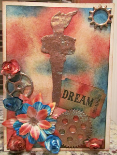
An ever so slightly different angle to make sure you can see the texture and dimension of the torch. I started off with one of the white basic economy card bases from M's. I cut two pieces of white cardstock. One to fit the card front perfectly and one a quarter of an inch smaller, so i would have an eighth of an inch border. Most of the products I used can be found in Erica's Craft Room Store. If you click on the product the first time I list it, it will take you directly to that product. I inked the edges of the card base and my larger piece of white cardstock with Tim Holtz Vintage Photo Distress Ink. I took the smaller piece of cardstock and inked it with Tim Holtz Fired Brick Distress Ink and what should have been Tim Holtz Faded Blue Jeans Distress Ink, but I can't find it so I used a different ink and it did not want to react as well as the distress inks. Once I had the red and blue splotches, I went back over the whole thing with the vintage photo. The flowers all started out as white. I pressed the flowers into the distress ink pads and then spritzed them with a mini mister, so the color would spread through the petals. I am not sure which ones are which, because I dump them all together in a container, but there are several different shapes to choose from and then you can layer them too.
The dream tag was inked in the same way and is one of the Tim Holtz Adage tags.I love these, because they add that little something my projects need. There are so many in a pack and different words that I get to spread them out over a lot of different projects. You get almost 100 of them for around four bucks. I love getting a lot of bang for my buck.
This picture is here to show what you can't see. I am the world's messiest gluer and you can not see it. Unfortunately, this glue and the embossing enamels are not something you can get from Erica, but if you decide to get some, use the code TS25 and Globecraft Memories will give you 25% off your entire order. This glue is Glastique matte. I didn't really believe it would be string enough to hold heavy metal embellishments, so I used a lot and it squished out, but it dried absolutely clear. You can not see it at all and it held the heavy metal. I also want you to see the metal piece. It is out of a multi pack of gears and sprockets from M's, but I changed the color by covering it with embossing powder adhesive and then coating it with Globecraft Memories Vintage Copper embossing enamel.  I love how it has that patina effect and the green is showing through. It is even more amazing in person.
This little metal embellishment is a Tim Holtz sprocket, but I covered it with the vintage copper also. It was copper to begin with, but not the patina copper I wanted.
The torch is a cricut cut. It is cut at 3 1/2 inches from the Stand and Salute cartridge. If you have a cricut and don't have this cartridge you will want to look at it. There is so much I use this cart for and not just military or patriotic pages. I have cut out pink ribbons for breast cancer awareness, planes for little boy pages, stars for all kinds of things, anchors for a cruise page. It really is a versatile cartridge and Ericas has it for only $34.99.
The torch is cut out of basic smooth cheap black cardstock, but covered with the vintage copper. Now when working with the embossing enamels, you can use the flash set or full heat set meaning you heat it linger with your heat tool. I completely heat set it and then after it cools, I come back and hit those areas again to really get the green patina to bubble up and show through. That is another one of the Tim Holtz gears up in the corner. Below is another closeup of the patina and aged metal effect.

Once again I would like to thank Erica's Craft Room for sponsoring my stop on this blog hop. In order to be eligible to win the gift certificate, leave me a little comment love and maybe tell me how you would spend your gift certificate. It is not required for you to follow me, but I would love it if you decided to follow.
Happy Crafting!
KathyJo


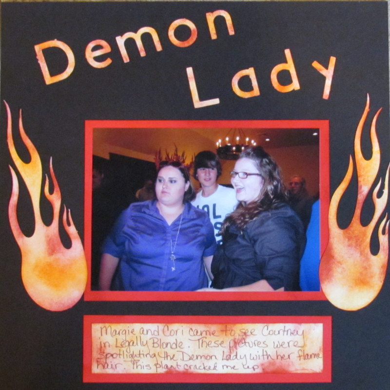
Demon Lady

Okay, I messed up! Wednesday is Would You Ever Guess Wednesday over at My Cricut Craft Room. That means we don't use the main images on our carts. We just use the feature or create keys on our machines. Well, when I was working on my project for this week I didn't realize on was working on a Wednesday project. I had written down the theme "On Fire" and not that it was a Wednesday project. I went with the "On Fire" and completely forgot about the special feature keys. I hope you like this as much as I do. I love how this project came out.
 This picture was taken after my daughter's performance in Legally Blonde the Musical. We were all in the lobby after the show and in  this pic it looks like my niece has a crown of flames. It was actually a naughty plant. When I saw are theme of "On Fire", I knew I was going to do something with this picture.

Obviously I started with a 12x12 sheet of basic black card stock. I used red and cut a 5 1/2 x 7 1/2 mat for my 5x7 pic.
 I cut the title from basic white cardstock using the San Serif Solution Cartridge at 2 inches. If you look closely there are some raggedy edges on some of the cuts. Normally this would be a problem for me, but I wasn't at home and was using someone else's machine. I am not sure if it was the quality of the paper or a dull blade, but I decided it was okay since it was supposed to look like flames and flames wouldn't have precise edges. Make sure you always have an extra blade on hand so you don't end up with raggedy edges. You can find them in Erica's Craft Room store here.
 I cut the fire balls from the solution cartridge Indie Art and 3 1/2 inches. These were cut from white cardstock also and then set "on fire" with Tim Holtz Distress inks. I used Fired Brick and Spiced Marmalade. I started with the Fired Brick and a piece of felt on a blending handle. Most people use a foam pad with the distress inks. I used felt because the ink would have been more even and smooth with the foam. I wanted the scratchy look and variations like you would have in flames. I added the red and then came back over it with the orange.
 I did the same thing on the journaling. The white was just too stark so I inked it up.
 I also added a little ink around the edges of the photo mat to give it a little more depth.

 These shots let you see her crown better.
 This layout was a lot of fun to make. I hope you will take some time to play with distress inks and see what you come up with. Now head on over to My Cricut Craft Room to see what my design team sister have come up with for you to enjoy.
Happy Crafting!
KathyJo

Friday, June 15, 2012

Scrapbook Friday at My Cricut Craft Room


It is Scrapbook Friday at My Cricut Craft Room and this week's theme was cars, trucks, and bikes. I was planning to do some motocross pictures, but I am feeling really emotional lately about Courtney. I am having a hard time dealing with the fact that she is now 16 and driving. I changed a scrapbooked some pictures of her driving to the theater. In some ways she is so grown up and in others, she is still a little girl.

The title was cut from yellow card stock using Lyrical Letters Jumbo feature. The papers are Bo Bunny. The patterned paper is from the On the Go Collections you can find here. I just tore the strip to go across the page and then inked them up. I inked the papers with Tim Holtz Wild Honey Distress Ink you can find here. The stop sign was fussy cut from the paper. The journaling is hand written. This is a simple page, but if we really want to record all the events of our lives, both big and little moments we have to have balance between the elaborate pages and the quick and simple. The second project I was working on for today, was the more elaborate. I decided to save it for another day though. Here are a few more pictures of this layout. 


Now you have two more stops. Head over to Erica's store here. She has great deals and keeps adding products. You will find something you have to have at a great price. When you are done shopping there, head over to her blog to check out what the rest of the design team made to share.
Until next time.....
Happy Crafting!
KathyJo

Sunday, June 10, 2012

Robin's Nest Audition Post

The Robin's Nest is looking for a new design team, and I decided it was time to throw my hat in the ring. The Robin's Nest is an incredible company. Their current design team is amazing. If you have not been to their blog recently, quit reading right now and head over to their blog by clicking here. I promise you will be amazed and will come away inspired. Anyway, I love the products The Robin's Nest has to offer and I think they will be good companion products  to complement the design teams I am already on now. The would make my projects for each company even better.

As I thought about what I wanted to do for this project, I decided I was going to do a home decor project. I wanted a nice huge 4th of July wreath for my door. I came up with an idea, but realized that there was no way my hands would hold up to the bending, folding, pinching, and holding of all those little pieces. My fingers were going numb and I knew that this idea would have to wait until a week when the hands were in good shape. I had some photos developed and was absolutely Wowed by the fact that my child is no longer a little girl. She is now a young woman. So the layout Wow came to be...

My first instinct with this layout was to layer tons of paper and make it very elaborate, but the whole point of the layout was to capture her. Not the Wow of piles of product, but the Wow of my child becoming a woman. Anyway, I decided to do what I do best and find balance. I needed balance between the photo and the products and using techniques to highlight rather than overwhelm the photo. I think this was a pretty good mix of all those things.


The title was cut from the darker side of a sheet of BoBunny Abbey Road Truffle. The letters were cut using the Lyrical Letters cartridge using the Loop Le Loo creative key at 3". The problem was the title was fading into the background. I wanted it to pop, so I broke out the enamel powders. I thought I was going to use vintage silver, but it still wasn't wowing me. I decided to go for the gold and covered the letters with enamel adhesive and then coated in 24K Gold embossing enamel. The shine and wow factor is amazing. I immediately knew I wanted some black mini dew drops on the letters, but I didn't have any. I subbed some small Prima Black pearls, but wouldn't these Classified Mini Dew Drops have been amazing? I outlined the letters with glossy accents to give it one more layer of shimmer. It didn't photograph as well as I would have liked, but it almost looks like they are floating.

 I wanted to add the date the layout. I pulled out this chipboard tile and the fleur-di-lis pieces and covered them in embossing enamel adhesive. I sprinkled them with Ranger Black Super Fine detail embossing powder and heat seat. Using the detail embossing powder allowed the pattern on the chipboard to show. I cut some small numbers and covered them with the 24K Gold powder as well. Although these chipboard pieces were some I had on hand, you could use one of the Robins Nest chipboard pieces to mount the date.
 The two flowers were made using the Tim Holtz tattered flowers die. The edges are inked and curled to give them more depth. I am not sure what paper these are made out of as I already had them made and in a drawer, but this paper would work beautifully. The swirls and flourishes were cut using the Cricut and then layered and tucked on the page. I accented the Swirls with dew drops which you can find here. There are so many uses for these little drops of goodness. They make centers for flowers, borders, feet for little boxes, and eye catching treats on a scrapbook page like this one.
 The dew drops above and below the quote make you eye stop and read the sentiment I wanted to share with my daughter. I hope one day she will read these words and know that I meant them.
I hope you enjoyed this layout. It has so many different elements, but I hope still keeps the balance. I don't want to the story lost, because that girl in the picture... she is the real story.  Good luck to all the applicants for the Robin's Nest Design team, be sure you go follow the Robin's Nest blog, so you will see who makes the team. In the meantime, head over to the store to check out all their wonderful offerings, so you will be ready to craft along when the new design team starts sharing their products. Until next time...

Happy Crafting!
KathyJo

Thursday, May 31, 2012

1st Attempt at a Bubble Frame

Globecraft Memories offers these amazing cardstock mini bubble frames. They are different than their book quality chipboard frames. These are made from a nice quality cardstock. They come in a three pack and are designed to hold a wallet size photo. I was simply playing and getting to know the product and this is what I came up with. Of course I started out with the crafting staple I am most comfortable with and grabbed a couple of my distress inks and got started inking.These cardstock frames are not available quite yet, but you can find their other frames here.
 Once I had it covered in ink, I wanted something to make the edges pop. I ran the edges across the top of the enamel adhesive dauber and then sprinkled Copper Kettle embossing enamel and hit it with some heat. Because the Copper Kettle is a micro fine powder, I got a really thin pretty copper edges. It would make a beautiful accent on a card.
 I used some of the Piccolo pieces to make an accent at the bottom. These are actually out of a set that is not available yet, but there are similar swirls and flourishes in the card decor sets here.
The little birds are also Piccolo pieces. I covered them with blue acrylic paint and let it dry. They needed a little sparkle, so I ran a versamark marker along the edges of the wings and then dipped it in the copper enamel powder. I then heat set it. The little heart I also covered in enamel powder. It was so tiny it wanted to blow away and the tweezers were getting in my way, so I took a repositionable glue dot and stuck it to my silicone mat. Once I heat set it I just peeled it up and glued it down. I glued all of the small pieces with Glastique. It was fun playing with the product.If you are ready to start playing with these wonderful items head on over and use the coupon code TS25. This will give you 25% off your order.